Artwork Leads
The interface stays quiet. Color comes primarily from Anne's work; UI color is reserved for links, status, and small accents.
Source-of-truth examples for Anne Spalter Studios: cosmic tokens, typography, layout rules, logo usage, motion, and reusable public components.
The interface stays quiet. Color comes primarily from Anne's work; UI color is reserved for links, status, and small accents.
Use a compact set of type and spacing steps so hierarchy is clear without billboard-scale headers on ordinary pages.
Legacy text, embeds, and news entries must fit the same reading measure, link treatment, and mobile rules as new content.
Build pages from repeatable cards, bands, forms, and media blocks. One-off page styling should be the exception.
Token foundations live in static/css/design-system.css. Public components and approved cosmic rules live in static/css/site.css. This page shows the contract those files expose.
Homepage display type caps at 50px. Page titles cap at 36px, section titles at 30px, rich-text headings at 32px, and ordinary text at 18px.
Templates do not carry ad hoc inline styles. Token demos use named classes, and imported legacy markup is normalized by the rich-text rules.
The visual check scans key templates for overflow, logo scale, oversized text, card counts, media bounds, component contracts, and non-FX inline presentation.
--color-accent-text and --color-eyebrow-on-sky tokens exist specifically to clear this on paper and cosmic surfaces. Interactive targets meet the 24px minimum (SC 2.5.8); the .backlink rule pins this explicitly. prefers-reduced-motion: reduce is honored across the starfield, comet, hero video, autoplay artwork videos, and card-hover transforms.
Paper-mode (light) surfaces and text. --color-accent is the brand red used for fills and borders; --color-accent-text is the slightly darkened variant used for small text (12px eyebrow labels) so it clears WCAG AA on --color-paper.
--color-ink--color-paper--color-surface--color-accent--color-accent-text--color-link--header-glass-bgThese bars show the spacing steps used for page padding, grid gaps, section rhythm, form spacing, and card interiors. Layouts should use these tokens instead of one-off margins.
--space-2
--space-3
--space-4
--space-5
--space-6
--space-7
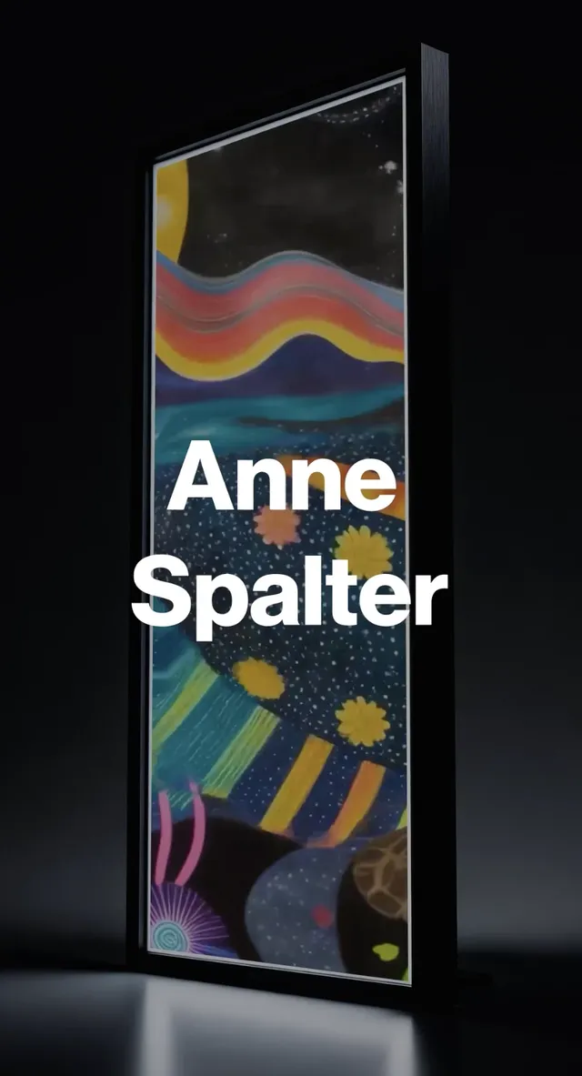
Anne Spalter
--type-display
Page titleArtwork
--type-title
Section titleSelected Work
--type-section
Rich text h1Anne Morgan Spalter
--type-content-h1
Card titleFuture Trains
--type-card-title
Eyebrow/metaPortfolio
--type-xs / .eyebrow
UI/bodyStudio updates and archive notes use readable body text.
--type-base
--font-display. The cosmic-theme nav also routes through it for letterform continuity.
--font-sans. Default body weight is 500 so cascaded sans descendants get a touch of heft instead of bare 400.
--font-serif. Designed for long-form screen reading with an optical-size axis (6..72); pairs with DM Sans by design. Georgia is the system fallback.
--measure), and generous line height.
Speculative landscapes
Clash Display 700 / --type-display / homepage hero only / max 50px
News
DM Sans 800 / --type-title / page heroes / max 36px
Selected Work
DM Sans 800 / --type-section / page sections / max 30px
Portfolio
DM Sans 800 / --type-xs / .eyebrow / 12px uppercase, 0.18em tracking
Anne Spalter is a visual artist and digital art pioneer whose practice moves between painting, animation, printmaking, sculpture, and immersive symbolic landscapes.
Newsreader (variable, opsz 6..72) / 16-18px / 1.55-1.65 line height
Use the square Anne Spalter Studios wordmark as a clean masthead anchor on a white field. It should never be cropped, stretched, shadowed, outlined in black, or used as a large hero graphic.
Header size: 96-128px desktop, 96-118px mobile. Footer icon: 40px. Border: white only.
Inline links stay underlined in reading text.
a.button pins color across :link/:visited/:hover/:active — without this, Chrome's UA :visited stylesheet wins on dark fills and washes the text to ~3:1.
Filterable archive view for artwork, named series, dates, and media.
2026
Message received.
Please check the form and try again.
Try removing a filter or changing your search term.

Speculative landscapes, digital systems, painting, animation, and sculptural forms from a pioneer of digital fine art.
Anne Spalter is a visual artist and digital art pioneer whose work moves between painting, animation, printmaking, sculpture, and immersive symbolic landscapes.
Read biography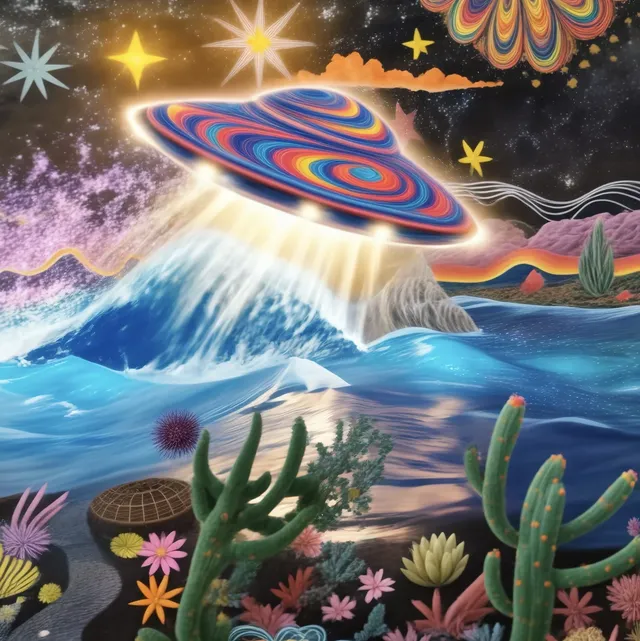
 Magical Weekend
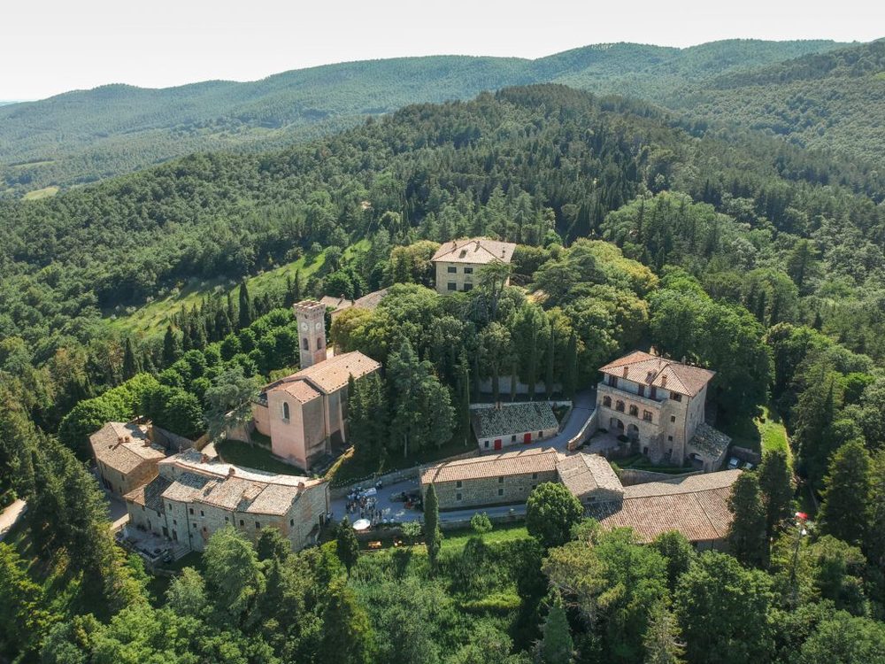
Anne will be in residence at the Essere Residency in Tuscany, Italy, in September 2026.
Read updateThese tokens activate when the body is in cosmic mode without theme-light. The theme-light class re-maps each on-sky token to its paper-mode equivalent in design-system.css, so a single rule referencing --ink-on-sky stays legible in both modes.
--sky--star-accent-1--star-accent-2--star-accent-3--link-on-sky--color-eyebrow-on-sky--control-bg-on-sky--control-border-on-skyThe body class defaults to theme-cosmic. static/js/theme-boot.js adds theme-light when localStorage as-theme=light is set, before first paint. :root declares color-scheme: light dark so OS chrome (scrollbars, native pickers) flips with the active theme. Mobile address-bar tint follows the OS preference via per-scheme <meta name="theme-color"> tags. The frosted-glass sticky header uses --header-glass-bg, which the theme-light block remaps from cosmic sky to low-alpha paper.
--ease-settle
Comet--ease-comet / --dur-comet
Twinkle--dur-twinkle
Cooldown8 hours between comet triggers.
--comet-cooldown-ms
Density scales with viewport area: 60 stars on a phone, up to 160 on ultra-wide (area / 10000, clamped). Sizes 1.0–2.3px, peak twinkle opacity 0.62, cadence 3.4–7.2s per cycle with 0–5.5s entry delay. 9% of stars take an accent tint (--star-accent-1/2/3) at higher base opacity. prefers-reduced-motion: reduce drops all animation and pins opacity to a static value via the JS branch in site.js.
--font-display — Clash Display with the DM Sans + system stack as fallback; used for the homepage hero wordmark on the starfield canvas and the cosmic nav.